
In Part 1 of this blog series we talked about how Power Pivot in Excel introduced a much anticipated enhancement for the strong Excel user. For the first time we learned to access, clean, and work with larger datasets all within the familiar environment of Excel.
Two years later (2015), this same technology would migrate into a brand new analytical tool called Power BI. A tool that at first glance seemed to overlap considerably with Power Pivot, would soon stand out as a superior way to create and visually share insights with the business.
For the Excel user willing to extend their skillset, Power BI is a win-win. You still create custom analytics from within Finance or Accounting, but instead of sharing directly from a spreadsheet, you now provide self-service access out to all of your data consumers. Flexibility, scale, and empowering others are key advantages of using Power BI. We’ll address this more in part 4 of this series.
In this Post 2, we are going to add a few more tables to our sample model (SteppingStone.pbix) and demonstrate the next foundational concept – Working with connected data.
As a quick reminder, this is post 2 in a four part series. If you need to access the first file in this series, here is the link to Post 1. It should only take you 20 minutes to walk through this first post.
In the upcoming posts (3-4) I will share an introduction to DAX as well as how to share data and thoughts on data culture.
Part1: Start using Power Query 101, and FREE learning resources!
Part 2: Working with connected data: Excel vs. Power BI.
Part 3: Learning Data Analysis eXpressions (DAX) vs. Excel formulas.
Part 4: Sharing information and data storytelling.
Let’s Begin!
If you are a VLOOKUP and Pivot Excel user, you are already familiar with the concept of connecting data between different sources. In Power BI, we have this same ability, but not through VLOOKUP (Although there are similar functions in DAX), but by establishing formal relationships between our different data source tables.
- Open our Power BI file that we saved form Part 1 that we named SteppingStone.pbix.
Next, lets download the small tables we are going to add to our data model. It is good to note here that although we are connecting to CSV and Excel files to keep our model simple, Power BI does support many other connection types including SQL Database, Web sources, and the list goes on. Check more file and connection types here.
2. Download the Excel file below and save this Excel file on your Desktop:
3. Open this Excel workbook (From the download) and look at the contents. We see there are three tabs which represent three different tables that have already been defined and named under the Design tab in Excel.
If you are not familiar with the ‘table’ structure in Excel, it allows us to enter data in rows and columns, then band those rows and columns together as one named object. By doing so, we ensure Power BI picks up only the relevant data, nothing more, nothing less in our sheet.
Optional: To create a table yourself in Excel, just enter data under your headers, click on a cell within that data, then click Ctrl+t to activate the table range. Check the box ‘My table has headers‘, and viola, you just created a table. To learn more about ‘tables’ in Excel, click here.

You can now click on the Design tab and name your table range.

4. Save the downloaded Excel workbook, then open Power BI, and Click ‘Get data’ from the Power BI Home menu. Choose the Excel file type.

5. Browse to where you saved our downloaded Excel workbook file and select the file.
By selecting your Excel workbook, your table options available will automatically appear in the preview window (Image 4).
The challenge below is that our spreadsheet tab names and created table names are almost identical. In order to distinguish the Excel table names from the tab or sheet names, we need to look for the icons with blue headers. The blue header indicates that these are the Excel tables we need.
Choose all three tables at once to import and click ‘Transform Data‘ to open Power Query.


By clicking on ‘Transform Data’ we open Power Query and see the three new tables added to the Queries on the left side of Power Query.

6. Click ‘Close and Apply’ after confirming that all three of our new tables need no further formatting or added transformation.

Now that we have added the three new tables, we are taken to the blank canvas in Power BI. On the far left of the blank canvas, we see three icons. The Report view is where we design our report with different charts and visuals. The Table view will allow us to view our data in the original table imported in from Power Query. Lastly, the Model view shows us our table layout and how our different tables tie together through relationships.

7. Click the Model view from above and view our tables loaded into our data model.
Below are the three new tables that we need to connect to the SteppingStone sales table we imported from Part 1.
Your tables may appear separated beyond your visible screen. Scroll over to the right, and drag them all the way back to the left side of the model view. If it helps, just like in Excel, you can zoom out using the +- controls in the lower right Windows tray.
Also notice that Power BI tried to help us out by detecting a relationship between our Customer table and our SteppingStone sales table. I have made a habit to delete and re-create my own relationships just for good measure. To delete, right click over the line that traces between the ‘Customer’ and ‘SteppingStone’ tables, and choose and confirm to Delete.

Terminology: You might hear tables referred to as Dimension and Facts. These are more data warehousing terms used to classify the function our tables serve. For our purposes, our SteppingStone sales table is our Fact table since it accumulates the daily transactional ‘facts’ of the business.
The three other tables that surround our sales table will be our Dimensions (Customer info, Part detail, and Calendar) as these tables serve to classify or add context to the sales orders in our fact table.
A common distinction between Facts and Dimensions is that fact tables tend to update as time passes, often daily; where dimensions may only change as needed.
8. Re-position your tables in your Model view to match the pattern in Image 10. If you read Rob Collie’s Power BI book (Which is written as an introduction to Power BI for the Excel user), you’ll learn the practice of keeping your dimension tables above your fact table. We’ll address the reasoning for this below.

9. Create your first relationship by clicking and dragging the Cust# field from our ‘Customer‘ table and drop it on top of the Cust# field on our ‘SteppingStone‘ sales table (Image 11).

Relationships between each of our tables are based on a one-to-many relationship. There are a few different options to this, but the one-to-many is the most common type.
You’ll notice that even if our Customer table contained two customers named Mark, each Mark would have a different customer number. It’s this unique Cust# field that ensures we have a valid relationship between our tables.
To learn more about how relationships work, check this blog out by Reza Rad.
By dragging and dropping the ‘Cust#‘ field from the Customer table to the SteppingStone sales table, Power BI automatically evaluates this relationship for any issues.
If for any reason the relationship is not valid, you will be prompted with an error window that will prompt you to work through a solution. This feature works very well and helps ensure data integrity.
10. Complete the other one-to-many relationships by connecting our Part and Calendar table directly to our SteppingStone Sales table. Do so by clicking and dragging one field to the other as shown below (Image 12).

Terminology: We talked above about dimension and fact tables. It should be noted that by placing dimensions around our fact table, and joining each table directly to the fact table forms what is called a ‘Star Schema’. The more complex alternative is called a Snowflake Schema.

The Snowflake as the name implies, is made up of a web of tables chained together, many of which indirectly connect through other tables before reaching the fact table. Thankfully in Power BI, the Star Schema is not only a more direct model type, it is preferred.
By breaking up tables and creating a star schema, we are streamlining our data model to make it more efficient. Can you imagine if we had to include all of our data in one single table? If our sales table only had 200 records, maybe… but working with two million sales records is a far different circumstance. If we tried using one table with that many records, we’d bloat our table only to discover most of our data was repetitive and not always reported on.
For example, say we wanted to have the option to report the customers Birthday. Should we list the birthdate each and every time we sell to that customer?
By listing the customer birthdate only once in a separate Customer table, we have the best of both worlds, a lean sales table that has the ability to access birthdate data if needed.
As far as how relationships interact with the data in our different tables, I imagine that the related tables positioned above our Sales table, act as ‘puppet strings’ controlling the view of our Sales detail (Image 13). The arrows on the relationship lines further support that information is flowing from the dimension tables (the ‘one-side’) down to the fact table (the ‘many-side’).

An alternate way to visualize this would be to imagine the data from the dimension tables (Customer, Parts etc.) lined up next to the sales table (Image 14). Although we don’t actually hold all of the dimension data in our sales table, it is still illustrative of relationships and our ability to blend this data together with our sales detail when needed.

In reality the ‘puppet string’ concept is not that different from filters over columns in Excel, that when filtered together help produce the final result in our report.
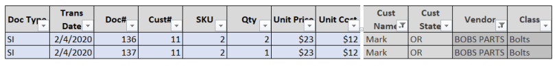
For example, if I use Excel to filter Customer = Mark, then filter Vendor = ACME, then my resulting report (Image 15) is going to properly return sales of ACME products purchased by Mark.

Let’s test drive this same filter approach in Power BI.
Click on the Model view icon (the bar graph icon) on the top left of Power BI. When you see the blank canvas follow the following steps below.
1 – Click anywhere in the blank canvas, then choose the table visual indicated in Step 1 in Image 17 below. Expand the table borders to view all the columns we will include.
2 – With the new table visual selected, open all tables under the ‘Fields’ well on the far right column. Click to expand each tables drop down arrow just to the left of the table icon. Then choose each field in the checkbox as indicated below.
3 – We do not want the Doc# field from below to be auto summed. To adjust for this, click on the down arrow to the right of the field in the ‘Values‘ box which is just under the Visualization grouping. On the dropdown of this Doc# field, choose the option ‘Don’t Summarize‘.

We now have the our table visual shown on our canvas in Image 17. We next want to replicate our filter from Excel. We need to add a couple Slicer visuals in order to filter by Cust Name and by Vendor.
4 – Click on a blank area of the canvas to ensure you are not still selected on the table visual we just created. Then click on the Slicer (Step 1 Image 18) visual to add it to the canvas. You can drag this slicer above the table visual.
5 – With the blank Slicer visual selected, Choose the Cust Name filed check box under the Customer table to add it to the Slicer.
Do the same steps from above to add a second slicer for Table: Part Field: Vendor.
Hint: You can use the copy/paste keyboard strokes to copy the first slicer made. You will need to delete the copied Cust Name field, then replace it with the Vendor field.
6 – With both slicers in place, we can now filter Mark as our customer, then BOBS PARTS and see that our Power BI report matches the Excel filter used from our original example.

In this post we have walked through how Power BI and Excel stitch together and filter data in different ways.
In Excel we use VLOOKUP to bring two lists together. In Power BI we formalize this by first validating the incoming columns of data first in Power Query, then further validating our relationships by ensuring we have a proper one-to-many relationship.
After establishing our relationships, we briefly explained the efficiencies gained using the Star Schema, and the flexibility of using our dimension tables to control the results in our report.
Our use of Excel to visualize how data flows and interacts through filters illustrates how closely these concepts follow and apply in Power BI.
While this is a very small example, these same concepts hold true when using tables containing millions of rows of data.
In our next post, we are going to move beyond the formal structure of tables and relationships and start adding our own custom calculations to our model using DAX.
As always, thanks for reading. I would love to hear your thoughts and ideas in the comments.
– Mark
Leave a Reply