-

Notes: The Definitive Guide to DAX
Check out my chapter notes on my recent pass through The Definitive Guide to DAX.
-

Power BI Learning Resources
Some of the best #PowerBI #DAX learning resources online! Thanks to Alex @itsnotaboutthecell for contributing!
-

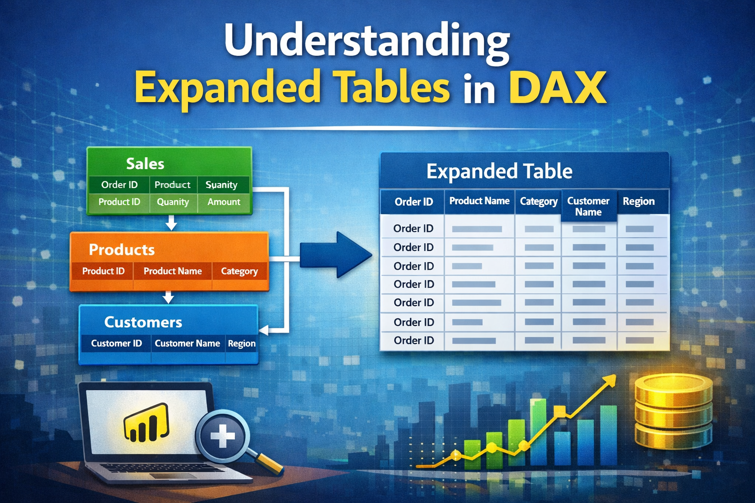
Understanding Expanded Table Concept
Filter context, context transition, and expanded tables are three DAX pillars that largely go unseen. When you can shed light on them, DAX stops feeling like “magic” and starts feeling predictable. This Saturday, our #SML group discussed when it’s appropriate to introduce
-

From Excel to DAX
By Mark Walter Learn from the Differences, Not the Similarities It’s common to compare Excel and Power BI—and understandably so. Both are powerful tools for analysis and reporting. Both serve analytical minds that are comfortable with formulas. And yes, many functions exist
-

Auto-Exist: What It Is and How to Avoid Unexpected Results
Read the SQLBI article here. Read the Jeffery Wang article here. Filters placed over multiple columns from the same model table end up combining (merging) together in the DAX query as a single column filter. This behavior is called auto-exist(s) and is
-

Learning Notebooks in Microsoft Fabric
The Microsoft Fabric Learn content and other community resources has been meaningful in my journey from Power BI into the field of data engineering. This post is a collection of my go-to learning resources and notes from my journey so far. I’m
-

Flatten Nested JSON in Microsoft Fabric
🚀 Using notebooks in #MicrosoftFabric: Whenever technology advances for citizen #PowerBI developers, it’s impossible for me not to pay attention! I’m thrilled to share how recent improvements in Microsoft Fabric have broadened my horizons by empowering me to create tangible solutions and acquire new skills. In this post, I’ll walk you through a step-by-step guide…
-

10 Advantages of Data Storytelling
I asked ChatGPT (our guest blogger today) to list 10 advantages of data storytelling. It’s good to know that even Chat recognizes value in a data professional sharing a meaningful data story, and how this improves engagement, momentum, and change in the business.
-

10 tips that help me visualize DAX & Evaluation Context
It’s interesting to watch students learn Power BI and respond differently to new concepts. ETL, modeling, and design are mouse clicks for the most part. However, it’s Evaluation Context and DAX that requires us to slow down, comprehend, conceptualize, and practice hands-on. I
-

Answering Unspoken Questions with Data.
Measures matter! How one performance measure empowered our teams to reach our goal.


